Canada Mortgage and Housing Corporation
Design System
CMHC Design System is designed to provide the fundamental UI design rules, principles, and essential components for web applications to ensure a consistent and accessible experience for users.
Overview
Tools
Sketch
InVision
Project Timeline
2 Months (remote)
Role & Contribution
Design System Design
Visual Design
Supported Device(s)
Responsive Web Design
HOW IT ALL STARTED
CMHC has been working on the digital transformation.
While teams were working on the new products and digital experiences, they realized there was an inconsistency & accessibility issue in the current design.
Challenge
In the past, teams and vendors have been working in silos, creating their own UI, logic and patterns with very little consensus holistically. This is where I came in to help to solve the challenge as a Product Designer of Design System.
***To comply with non-disclosure agreement, I have omitted and obfuscated confidential information in this case study.***

Problem
How might we design a Design System to satisfy all the needs within 2 months?
We realized there was no design system or style guide in place to provide clear guidance for the design. A Design System seemed like a great solution to solve the problem however the client did not have the budget and time to create one. A UI Kit (basically a simplified design system) was the compromised solution to at least provide the necessary rules and guides for the design and infrastructure for a design system.
This is what client had
Their old UI style guide was lack of fundamental design principles and guidance which caused the inconsistency and accessibility challenges for the experience.
Project OKRs
Build the foundation of a design system:
Improve the consistency issues for the current web ecosystem.
Create an accessible web experience for Canadians.
Provide a UI component library to build the new web pages.
Build the design principles and lay the foundation of a design system for the future.
Increase the design production/development efficiency.
MY ROLE
Aa a Product Designer of Design System
Learned CMHC’s branding, existing design pattern, and their vision for the future product.
Created a thoughtful UI Kit (component library), with a great potential to become a design system for CMHC’s ecosystem in the future.
Worked with CMHC’s brand team and their graphic designers to create new icons to accommodate different needs for various scenarios.
Worked closely with the development team (Front-end & back-end) to validate the technical feasibility/cost/challenges when designing the net new UI components and the UI Kit.
DESIGN APPROACH
To build new web design principles, standards and component library –
1 - Learning the brand and vision
UI Kit should respect the company's brand, as well as its mission and vision. By learning the philosophy behind the brand opens up a door for us to build a UI system that resonates with CMHC's tone and impression.
2 - Visual audit on the current design
Auditing the current design which was built by multiple vendors. Identifying the inconsistency across the entire experience, incorrect interpretation of the brand and as well as accessibility issues.
3 - Creating a scalable component library
Creating the visual design language and building a logical pattern along with a UI component library. Working closely with CMHC's Brand team to ensure it's recognizing the brand guidance and its vision.
4 - Development and documentation
The bigger image of this UI Kit is to set as a scalable foundation for a design system in the future. I work closely with developers to create a maintainable system with standards documented.
PROCESS
Design a Design System
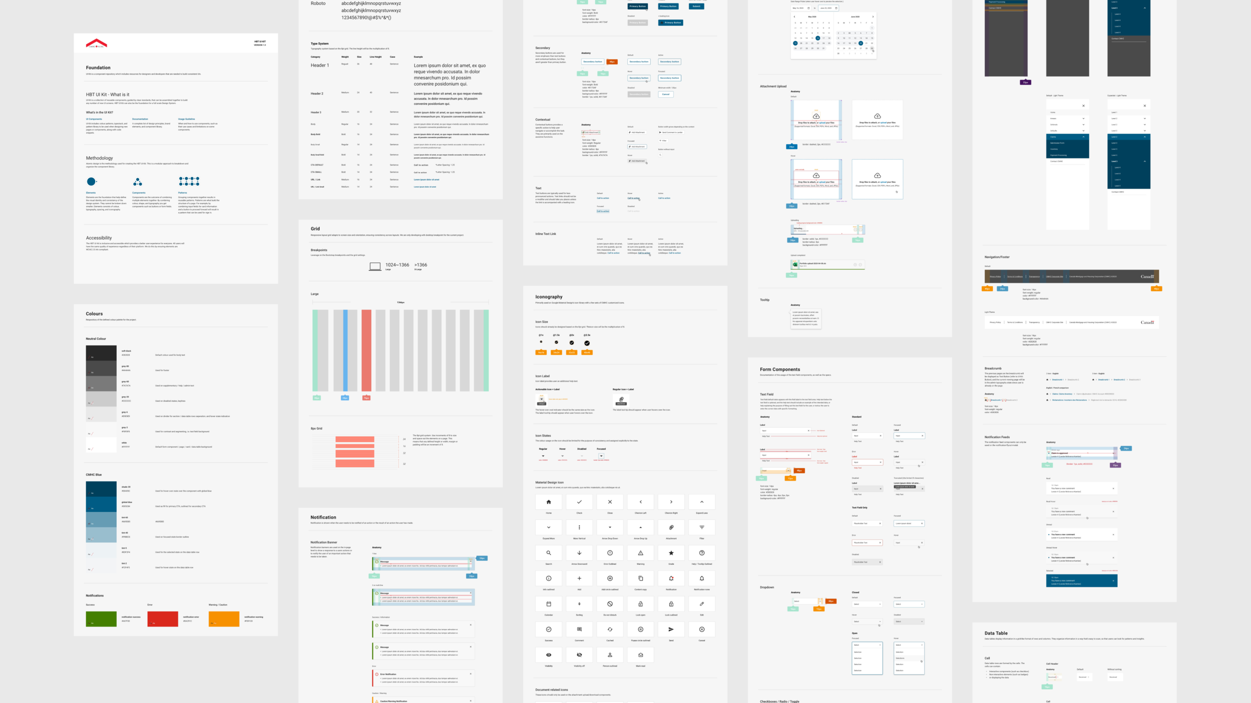
Design System is a collection of reusable components, guided by clear standards, that can be assembled together to build any number of new UI screens.
METHODOLOGY
Atomic Design
Atomic design is the methodology used for creating the CMHC UI Kit. This is a modular approach to breakdown and organizes the component library.
Colours
UI Kit indicates the primary colour palette and the system for building accent colours based on the CMHC Branding guideline.
Accessibility
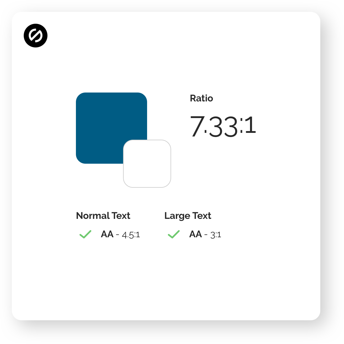
UI Kit is inclusive and accessible which provides a better user experience for everyone. All users will have the same quality of experience regardless of their platform. We do this by ensuring the elements are WCAG 2.0 AA compliant.
Typography System
Font Choice
Inherited from the current design pattern, Roboto is the font going to be used across the CMHC ecosystem.
Type Scale
The current design has no clear type scale or guidance and it caused a lot of inconsistency across the current experience. To solve the challenge, we built a type scale to provide a range of contrasting styles that support the needs of the content and ensure a consistent information architecture across all products
Iconography System
Material Design icons
To save the cost and time effort, we earned the mutual consensus between the product design team and CMHC's brand team to move forward by using the Material Design icons.
CMHC Custom Illustration
In some use cases, for example, on the banner, we need a visual artifact that can deliver a better message and context more than an icon can handle. We provided the instruction for the graphic designer from the CMHC brand team to create a few illustrations to support the needs, while respecting the branding's guidelines and also harmony with Material Design icons.
Component Library
Building the component inventory
We audited all the components from the current design, made improvements based on the accessibility needs and analyze what is missing in the current design library. We collected, recreated the essentials, such as button, form and modal, etc.
Collaboration with developers
We worked very closely with the developers to measure the effort and time cost of creating our component inventory, to ensure the UI kit is feasible to build and the amount of work still stays within the client's budget and timeline.
Support with my Front-End knowledge
The developers did not have the access to the InVision to inspect the component library I created for a few weeks due to the licensing issues. Therefore, I leveraged my front-end development knowledge and proceeded to provide a detailed CSS styling code for the components I created to help accelerate the development efficiency.
Example of my CSS support
Product Templates
After having the Design System built, we created several templates to demonstrate how it makes more sense to our clients and our final output.
Templates consist mostly of groups of organisms stitched together to form pages. This is an opportunity where we show how the design coming together and start seeing things like layout in action.
Impact
Successfully improved the project development's production efficiency by 70% and increased the quality/quantity of the deliverables.
Client Feedback
“Luke did a great job by delivered a beautiful system for our online ecosystem within a short amount of time, it really helped us made a big step forward in the digital transformation process.”
– CMHC, Executive
Key takeaway
CMHC was my first fully remote project since the pandemic, it was a great learning experience for me not only figure out a way to collaborate with the client stakeholder I've never met face to face but also a rewarding opportunity for me to help them build the skeleton for something bigger.
Efficient communication and rapid design sync up calls definitely helped me close the gap between the stakeholder team. The quality of communication, be a proactive and detail oriented person has become extremely important than ever especially during the pandemic.


